What is CSS?
CSS (Cascading Style Sheets) is what gives life to your HTML, it describes how HTML elements are going to be displayed, ordered, and styled on the page
There are many ways to implement CSS, for this tutorial we are simply going to use what is known as internal CSS. Where it's wrapped in a tag. labeled script
THE TARGET: The element in the HTML document we are looking to change. It could be the name of a tag, an ID, or a class name.
THE KEY: The key describes the change we are trying to make, whether it's the width, height, color, or the outline.
THE VALUE: The Value that we are changing, it can be a color hex like #333333 or any other value that the key will take.
In the above example, we are targeting the body of the HTML document and giving it a new background-color property of the color "powderblue"
We are now going to review targeting different things and the values they can take
IDs vs Class
IDs: These are used for when you have a single thing on the page you want to target, whether for CSS or JS purposes.
IDs are targeted in CSS with #idname, as will be demonstrated below.
Classes: These are used for when you have many things you want to apply the same style to or have many things you want to target.
Classes are targed with .className, as will be demonstrated below
For example, if we wanted to create a site that features people's favorite music and allows them to share it (hint), we would have all of the album art be in the same class
However, since we will only have one main logo, it will have an id that signifies it as such.
General CSS
When working with CSS there are things that apply to everything such as borders, margin / padding ( which we will with the box model ) and much more. To demonstate this we are going to be using a div with a class of container ( the fact that it is named container doesn't mean anything and doesn't effect anything, it could be named literally anything else. ). All the CSS that we apply to this container will apply to everything inside of it.
Borders : border: size(for now we are using pixels) style (dotted/dashed/solid/double/groove/ridge/inset/outset/none/hidden) color(hex / rgb)
Background Color : background-color: color(hex/rgb)
Text Color: color: (hex/rgb)
Width: this determines the width of the item width: (measurement in px / vh / vw / em / etc. For this we are using px, we'll cover responsiveness later)
Height: this determines the height of the item height: (measurement in px / vh / vw / em / etc. For this we are using px, we'll cover responsiveness later)
Text Alignment: just like any text editor, we can align text either left, center, or right text-align: left/center/right
Overflow: items overflowing the immediate view is what causes a scrollbar to appear, if you want you can modify how overflow is handled where hidden hides everything that overflows, and scroll adds a scroll bar overflow-(x/y): visible/hidden/scroll
Margins : this is the spacing OUTSIDE of the item, social distancing is a 6ft margin. margin: 2px(top margin) 10px(right margin) 0px(bottom margin) 0px(left margin)
Padding : this is the spacing between the element and it's border. If you were to print out an image, the white space between the edge of the paper and the image is padding.
padding: 2px(top padding) 10px(right padding) 0px(bottom padding) 0px(left padding)
In the following sample, there is a div with a container that contains text and an image. You are going to play around with each of these.
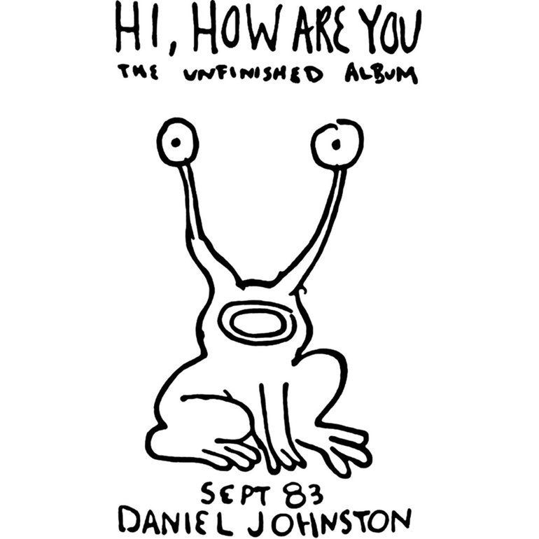
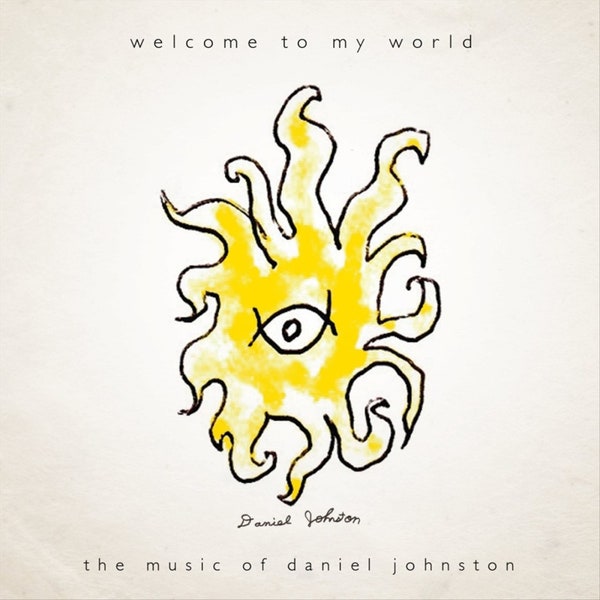
Hey, have you guys heard of Daniel Johnston? He's an outsider artist who makes really beautiful but simple music about his life, mental illnesses, and the human condition.
Working With Text
When working with text, the most common things to modify are size, color, and background color.
Text Color: color: (hex/rgb)
Background Color: background-color: (hex/rgb)
Font Size: font-size: 10px(px/vh/vw/em/etc)
click here for a more detailed explaination
In the following example, there's black text on a black background, fix the text and make it able to be read!
Working With Images
Since images are so important, this is where it can get a bit... a lot. There are ways to do basically everything with images that you can think of. We are able to apply filters, round images, size, flip, make responsive, arrange, align, mess with colors and transparency, and a lot more. We can't cover it all here because I can't cover EVERYTHING you can do with an image, we are going to cover the basics now, and I'll make another lesson solely for all the fancy stuff. If you want to work ahead and do your own research, I recommend starting here at w3 schools.
Rounded Border: border-radius: 50%(it is recommended that you use percentages, however all other measures are viable)
Borders : border: size(for now we are using pixels) style(dotted/dashed/solid/double/groove/ridge/inset/outset/none/hidden) color(hex / rgb)
Background Color : background-color: color(hex/rgb)
Width: this determines the width of the item width: (measurement in px / vh / vw / em / etc. For this we are using px, we'll cover responsiveness later)
Height: this determines the height of the item height: (measurement in px / vh / vw / em / etc. For this we are using px, we'll cover responsiveness later)
In the following example you have an image of a chicken that we need rounded, and made into a square

FLEX BOX
Flexbox makes layouts simple as hell, combined with CSS grid it can be used to make power, beautiful, and responsive websites. It replaced floats and all the hacked together garbage layout methdos that preceeded it. This feels like a lot, and it is at first. I promise that it's easy to get your head around when you play with it for a bit, which is what we are going to do now!
Initiating Flex: Flex is declared on the container and determinds how things will be laid out inside of the container. In the container itself we need to initiate flex using
display: flex
Direction: flex-direction:
row (items are displayed in a row going left to right)
row-reverse (items are displayed in a REVERSE ORDER going left to right)
column (items are displayed top to bottom)
column-reverse (items are displayed top to bottom in A REVERSE ORDER)
Horizontal Alignment: justify-content:
flex-start(aligns items to the left of the container)
flex-end (align items to the right of the container)
flex-center (align items to the center of the container)
space-between (even spacing BETWEEN all items)
space-around (even spaceing AROUND all items)
Vertical Alignment: align-items:
flex-start(aligns items to the top of the container)
flex-end (align items to the bottom of the container)
flex-center (align items to the VERTICAL center of the container)
baseline (Items display at the baseline of the container)
stretch (Items are stretched to fit the container)
Wrap: When there's too much to fit in a single row / column, this will determine how it is wrapped around flex-wrap:
nowrap (nothing will wrap, it will just continue)
wrap (items that would overflow are wrapped into the next row/column)
wrap-reverse (items are wrapped in the REVERSE order)
Spacing Between Rows: When items wrap around and create multiple rows / columns, this determines how it will be spaced. align-content:
flex-start (lines are packed at the top of the container)
flex-end (lines are packed at the bottom of the container)
center (lines are packed at the vertical center)
space-between (lines display with equal spacing BETWEEN them)
space-around (lines display with equal spacing AROUND them)
stretch (lines are stretched to fit the container)
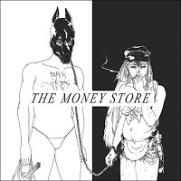
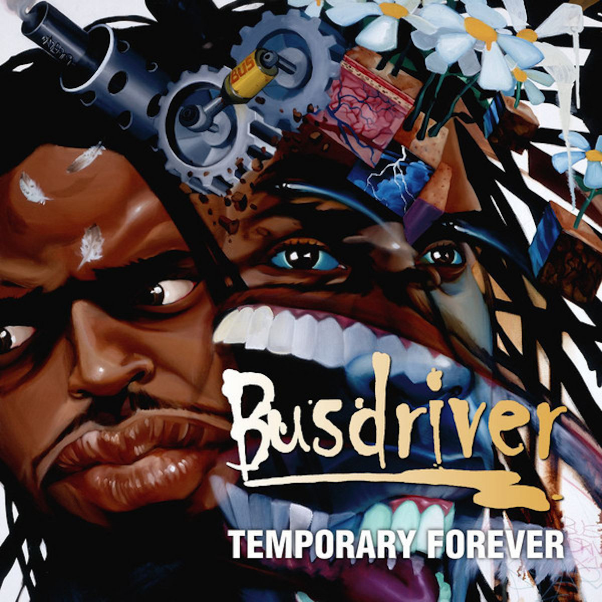
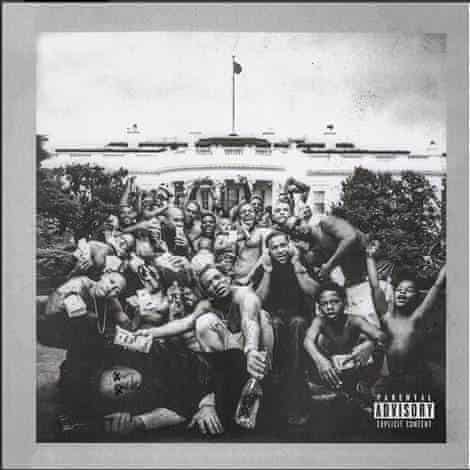
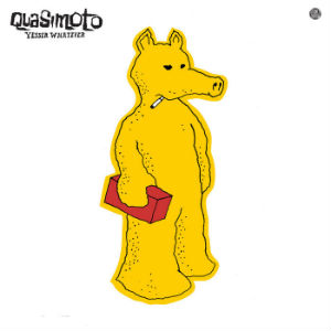
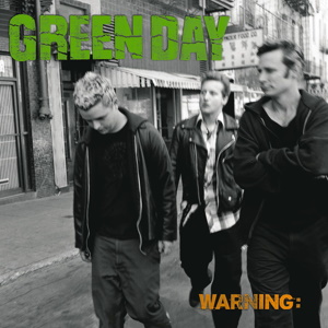
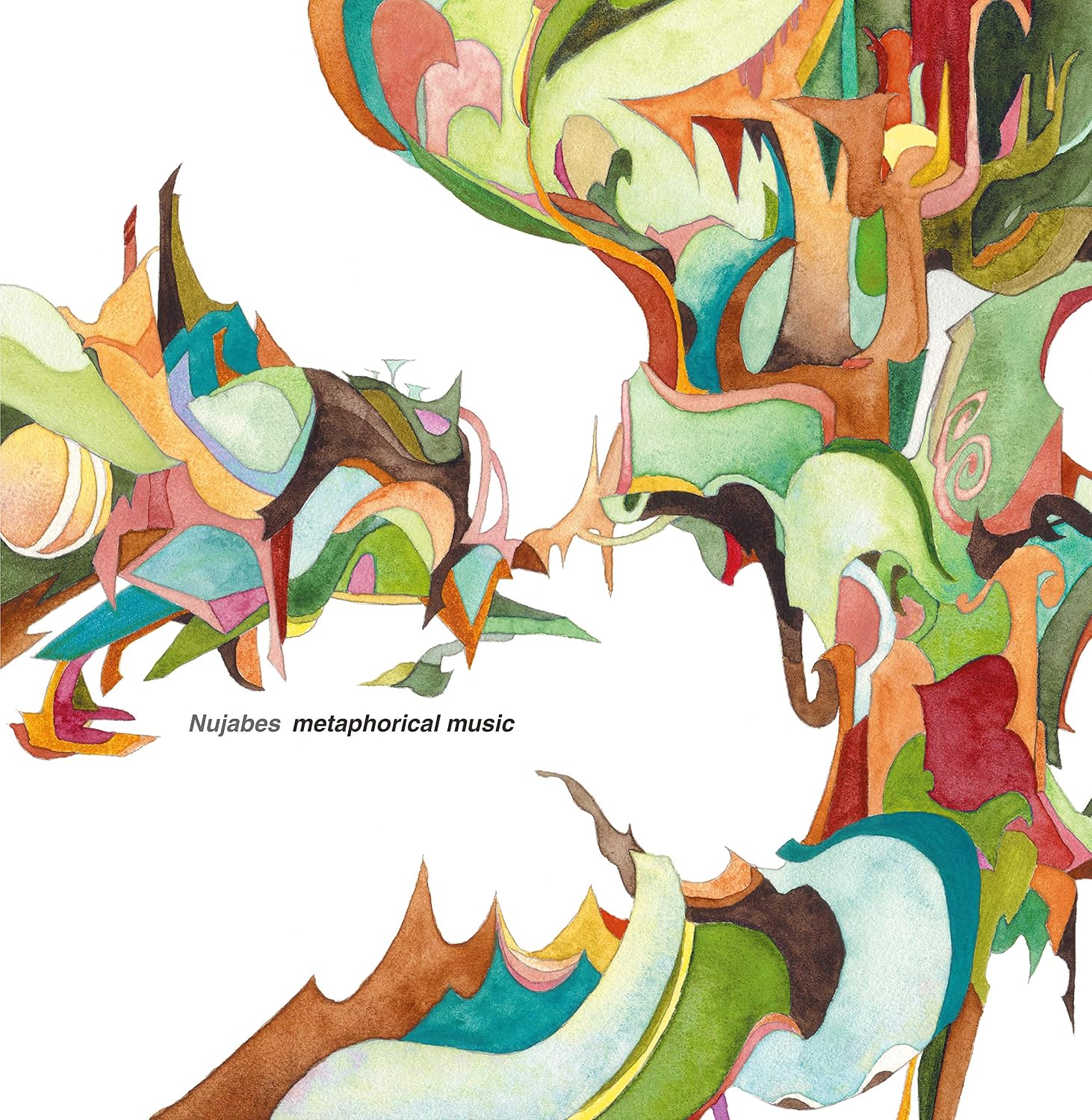
In the following sample, you're going to be using flex to order 12 of my favorite albums. I did leave out some I couldn't find good covers for.